How to Tame The Zen nineSixty Theme

For all the hype this theme has received, I would have guessed it was created by Steve Jobs himself. Every blog post, review, and so-called "how-to" explains why a grid system is highly preferable, how it will streamline your designs, how it will change your life and make you pancakes for breakfast, etc...
960 Resources
- The Zen Ninesixty Theme
- NineSixty Demo
- The Block Class Module
- "Accelerated grid theming using NineSixty" slideshow
- Pros and Cons of 960
- Example of horizontal blocks inside a region using NineSixty
Things to keep in mind when editing NineSixty.
- Do not edit framework/960.css within your theme. Add your classes to styles.css
- The main content area is already set up to switch places with the sidebar-left. This is so that the content area is output before the sidebars for users with mobile devices.
- The main area has already been assigned the class ".push-4," and the sidebar left has been assigned ".pull-12" meaning they have switched places in the layout. See Slide 67 and 68.
- To be sure that your blocks with background images or colors extend all the way to the bottom of the content they contain, add the classes ".clear-block:after " and ".clear-block" to your blocks.
-
One thing I found NineSixty is lacking is top and bottom padding, you may want to add a basic
.block-inner {
padding:10px 0;
}
to your css. - Remember that every time you change the page.tpl.php or the info file to add new regions, you'll need to clear the theme registry by flushing the Drupal cache.
A few even explained how the grid classes work. But there were not many that explained what to do once you have downloaded the Zen sub-theme NineSixty, and where to begin editing it. I will attempt to explain where to begin and how to customize the Zen NineSixty subtheme for Drupal.
Understanding NineSixty
The whole concept is based on the idea that you should begin with a set page width of 960 pixels because it is a highly divisible number. There are a predetermined number of columns, either 12 or 16, and most every element that is on your web page aligns itself with these columns.
The best way to try to understand the concept of Ninesixty is to imagine every block or region on your site as if it were a square Tetris block. Now imagine some Tetris blocks are two units wide, some are three, some are four, etc. But they are all based on the same standard unit. For example, if you choose a 12-column grid system, each "unit" is 60 pixels.
Here is the break down of column widths for a 12 column grid.
- 60px
- 140px
- 220px
- 300px
- 380px
- 460px
- 540px
- 620px
- 700px
- 780px
- 860px
- 940px
*Note: Open up framework/960.css in your theme directory for a full list of pre-defined grid classes, but don't touch it. I repeat, don't touch it. You're only using this for reference purposes. You'll have to decide early on if you want to work from the 12-column template or the 16-column template. If you are working with the 12-column design, you'll only need to pay attention to the classes that begin with ".container-12", the rest don't apply to you. The converse is true if you are working with the 16-column design. You can also check out ninesixty.fkdemos.com if you are more of a visual person.
Now, every div in your design has a specific width, and everything is told to float:left, which also means every block will float to the top of the screen. So it's just like Tetris, only upside down. Small divs will float up into available space if they will fit. Don't fight this; use it to your advantage. If you haven't already read the full description of how the grid classes work (and how to compensate for margins) check it out now. Go ahead and skip past the intro, to the meat and potatoes on slide 23.
Making the theme your own
For beginners, I would recommend installing Zen, the standard Drupal starting-point theme, and then installing Zen NineSixty as a sub-theme for Zen.
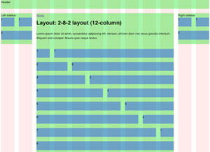
When you activate Zen NineSixty, go to the Theme-specific settings (admin/build/themes/settings/zen_ninesixty) and activate the 960 Grid system image. This will show you the columns you're working with. Then check off the Wireframes box, which will display border around the main layout elements.
*Note: turning on wireframes will throw off your alignment by 2 pixels on every div. Don't worry, it will all line up when you turn them back off.
When you install the 960 theme on your site, it will look like this. If and when you decide that you'd like to adjust how wide your sidebars are, or basically adjusting the default size and location of any region, you'll need to open up page.tpl.php within the Zen NineSixty theme folder. You'll notice that each region already has classes assigned to it.
For example, on line 112, the sidebar-left region already has the class ".grid-4." This means that it will span the width of 4 columns. If you wanted to make it thinner, you could change this to read ".grid-3" or ".grid-2" instead. An important thing to notice about the left sidebar in particular, is that it is being output after the content area, but it appears first in the layout (left-to-right). This is because the main area has been assigned the class ".push-4," and the sidebar left has been assigned ".pull-12" meaning they have switched places in the layout (see Slide 67 and 68). This is standard in Zen as well, with the reason being that content is more important than the sidebar, so users viewing your site on a mobile device will want to see the content first. So if you are changing the width of your sidebar-left, you'll also want to adjust these push and pull classes to match.
You only need to adjust the major regions in the .tpl file, don't worry about individual blocks.
The great aha moment
One of the biggest breakthroughs I experienced when learning to work with this theme was discovering the Block Class module. When you install this, it allows you to add classes to blocks from within in the block itself, as you are creating it. That's right, you don't have to go back to your .tpl file or your stylesheets to put things where you want them. Use this handy 960 Gridder overlay to figure out which classes you need, and add the classes you need to each individual block. Don't forget you need a container class and a grid class on each block, and probably an alpha or omega class since blocks are nested in their regions, for example, "container-16 grid-1 alpha." See the full list of classes in the 960.css file.
And finally you may be asking yourself, "What about blocks that I don't want to align with the all-powerful grid?" Fear not! You can also add or remove padding and margins by adding pre-defined classes to your blocks. Add a .prefix class to add padding to the left side, or .suffix class to add padding to the right. See line 186 in the 960.css for a list of the padding widths. The .alpha class removes the left margin, and the .omega class removes the default right margin.
Only customize the css of this theme from within zen_ ninesixty/styles.css. And resist hacking the grid too much with negative margins. It will only make your life difficult later. Work with the grid, not against it! Just to get inspiration, check out these amazing sites built using the 960 grid system.
Sub-Theming from scratch
If you feel like building your own sub-theme from scratch, the best place to begin is to print out the helpful PDF grids and mapping out your regions with a pencil. Don't overlook this step, or you'll be hating yourself later. At this point you should make the all-important decision of how many columns you'd like your grid structure on. You may choose between 12 columns or 16. It doesn't make a huge difference but this is the point of no return when it comes to future theming, so choose wisely.
Try to think big picture when you are creating your regions. You don't need to create a region for every nested block. You can adjust them individually later. Just worry about size and placement of sidebars, the content area, and headers and footers. I have also found that it's never a bad idea to include a content-top and content-bottom regions just in case. It's easier to add them now and never use them than to go back and shove them in place later. Once you have your grid laid out, begin labeling each div with the appropriate classes, like slide 29.
I hope that sheds a bit of light on the subject and motivates you to unleash the potential of NineSixty in your own Drupal sites! Much thanks to Joon Park for creating the NineSixty theme for Drupal, based on the 960.gs grid system by Nathan Smith.
Caravan is a powerful and full-featured membership management system, designed specifically for membership- driven organizations.
Trailhead is a Drupal-based system, built with the features smaller businesses need, bundled together into a ready-to-launch package.
Our Work
 |
 |
 |
 |
 |
 |
 |
 |
 |
On the Trail Blog
-
We are thrilled to share that one of our...
-
Steve was recently invited to write a...
-
We have some really exciting projects in...
Comments
fantastic post!! thank you for so detailed instructions.
i have a problem with css which file did i need from zen to them zen_ninesixty
You must install both Zen and Zen NineSixty in the themes directory, but you can completely theme Zen NineSixty by editing styles.css within the NineSixty sub-theme. No editing of the Zen files are necessary.
**Note, if you install "NineSixty" and not "Zen_Ninesixty" then the two do not work together. Be sure you've got the subtheme, not just the original NineSixty theme.
Hey, what happened to the link to the presentation?! Can we still get a copy someplace?
I just found a copy of the slides here: http://www.slideshare.net/fourkitchens/accelerated-grid-theming-using-ni...
Just thought I would drop a quick note... I installed Drupal and worked with the default themes...
This meant I could not find a template.php file in them... at least the one I did find (in the garland theme) didn't have the "nameoftheme_regions()" function in it... So, I kept hunting until I found the "engines/phptemplate/phptemplate.engine" file. I then added the custom region to that.
Is that what is supposed to happen? This way I now have the region added to all themes that use the php template engine?
Make sense? Your thoughts and wisdom would be kindly appreciate!
Owen
http://www.luckymountainhome.com/
Mountain real estate web developer
Hi Owen, we recommend not hacking Drupal core. A better approach would be to clone the Garland theme into the sites/all/themes folder and then edit the garland.info file to include your new regions. Then define those on the page.tpl.php file. Check out the support forum post "Adding new region to Garland Theme" on drupal.org for more information.
Kendall.. I have gone through your instructions but it only showed the css part of it, what about the page.tpl.php part of 960, how do you add your regions. Can you please add or show us a sample page.tpl and a style.css for a working theme.
This can be hard for the few of us that are not pros in theming..
Thanks
Thanks for your comments, I just posted a new blog entry on adding regions to the ninesixty theme.